


Above is the most important piece of information for understanding ‘peak oil’ in our times, courtesy of the oil analyst John Peach. To break it down: In red, the cumulative discoveries (all oil discovered in human history at a given year), in blue the cumulative oil consumption (all oil consumed in human history at a given year) and in green cumulative discoveries minus cumulative consumption. When green line go up, it means that our oil discoveries are exceeding our oil production (sustainable); when green line stable, it means that our oil discoveries are equal to consumption (sustainable); when green line go down it means that our oil discoveries are not keeping up with consumption (unsustainable).
As the graph shows, from approximately 1985 to 2023 green line goes down, meaning we have been burning more oil than we discover each year since 1985, and the pace has increased since 2010. Woe to those who say that we will just keep finding more oil to keep up with demand. It was the immense quantity of oil that was discovered from that great period from 1950 to 1985 that has enabled our continued high oil consumption since 1985. For reference, in 2023 the globe burned 30Gb of oil (1Gb = 1 billion barrels) and discovered 5Gb. In other words, in 2023 the world burned 6 times as much oil as it discovered! This would have been an unthinkable statement in 1965.
The graph below illustrates the growing severity of the oil discovery deficit, with production (I.e consumption) far outstripping discoveries for many years now. Note that it doesn’t include Canadian and Venezuelan tar sand discoveries, which have a low EROI and are consequently very expensive to produce, a concept that will be outlined later in the article.

Why is Oil Still so Heckin Cheap Then?
Pro-tip: when you’re looking at a chart showing you the price of a commodity over time, make sure it’s inflation adjusted.
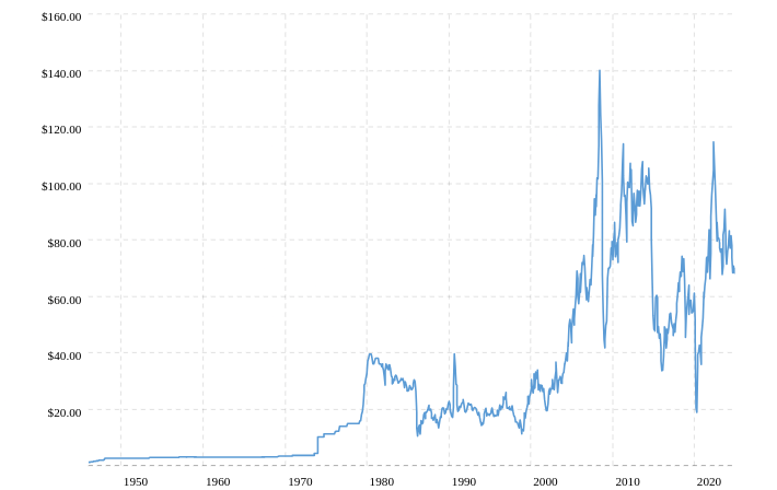
Above is a standard oil price chart that you’ll typically see (that does not adjust for inflation). In reality you should be looking at the inflation-adjusted chart below (unless you’re trying to dishonestly scare people):

A solid question that may be asked is: If oil consumption has been unsustainable for the past 40 years, and oil discoveries of oil keep decreasing relative to production – why is the price of oil (inflation-adjusted) half what it was in the mid-2000s to mid 2010s?
Innovations and massively increased capital expenditure (0 to 1% interest rates will do that last part) have massively increased oil production in the United States from 2008 to 2019. This defied the Hubbert Curve which Peak Oilers talked about so much, making them look dumb.

All of the attention of the Peak Oilers (even among most now) is towards total production, they tunnel-visioned on the Hubbert Curve, which was true. Until it was not. (Even to the extent of naming the whole movement of scepticism of oil’s long term viability “Peak Oil” after the peak of the Hubbert Curve, it stuck). The bulk of the arguments the Peak Oilers prepared and the image painted to the educated public was that the change in production (positive or negative) is a direct indication of the future viability of oil. It is not. But either way, oil production in the United States declined from the 80s until 2008, following the Hubbert Curve, so the false argument was effective for their purposes and gathered much attention to the Peak Oilers’ cause.
It turns out that today oil production is not *directly* correlated with the size of oil reserves due to improvements to drilling technology and increases in investment. This has not changed the fundamental point that oil consumption has outpaced oil discoveries, meaning current oil consumption is reliant on oil discovered years ago. But as the Peak Oilers of 20 years ago did not focus on that point, but on declines of oil production which caused them to be smashed into irrelevance by the unexpected increases of production of the 2010s. The common understanding is that they were “disproved”. Yes, on their narrow point that oil production would fall, not increase in the 2010s, but not on the fundamental claim of anything near current oil consumption being viable into the future.
Old Peak Oilers shot themselves in the foot by portraying the decline in oil production as indicating the future viability of oil. When oil production started increasing again they were caught flat-footed when their own arguments were turned on them.
To round off this point, increases in oil production due to increased investment and improvements in drilling technology have driven down the price of oil since the early 2010s, though oil prices adjusted for inflation have still stayed at roughly double the mid 1980s to early 2000s level. Hubbert’s Curve was wrong and Peak Oilers who used it as the backbone of their arguments that oil would not sustain an industrial civilisation in the 2020s were humiliated. However, the key point that current oil consumption will not be viable in the coming decades is still true.
Energy Return On Investment (EROI)
EROI is a concept that allows us to illustrate the degree of surplus energy that an energy source creates. It is calculated by dividing the energy gained by energy invested.

The higher the ratio, the more effective the energy source. For example, imagine a subsistence farmer who’s body burns 2800 kcalories after a hard day’s work harvesting 30000 kcalories worth of potatoes. You could calculate the EROI as being 10.71. For every kcalorie put in the farmer got 10.71 kcalories out. The astute among you may have seen an issue with my calculation, I did not account for all the calories expended by the farmer when he planted and tended the potatoes. Now you can understand the issue that plagues all EROI figures and is a cause of much debate. At what level of granularity of the process do/can you account for energy inputted? If I assumed that the farmer spent an additional 2800 kcalories in tending and sowing the potatoes, the farmer growing potatoes would only have an EROI of 5.35. Maybe I could add the energy of the wood burned in his stove cooking the food he eats in the work day to energy expended, this would further lower the EROI. And so on.
Nevertheless the concept of EROI is sound. Note while you’re doing your own research that it is more common to overestimate the EROI of an energy source than to underestimate it.
The higher the EROI value, the greater the complexity the system can have as there is more surplus energy to dedicate to other things. Perhaps the farmer will have the surplus energy to not spend his days farming and instead replace his mud hut with a thatched roof by building a wooden cottage. Perhaps he won’t. For more information on EROI’s relation to civilizational complexity, watch any lecture by Joseph Tainter e.g

Compare the subsistence farmer with American oil prospectors in 1910. All the oil man needs to do is drill shallow well (often it was just 100 feet!) and in a few days produce more surplus energy than the subsistence farmer will produce in his lifetime. Say it takes 1 unit of energy in drilling and equipping and feeding the men for 100 units of output. An EROI of 100. Think of the things that can be done with such energy! It’s all around you.
How does EROI relate to Peak Oil? Essentially, the oil which has the highest EROI is exploited first, as time goes on the remaining oil has lower EROI as it is substandard. This oil becomes ‘economical’ as the high EROI “cheap oil” is used up and the price of oil increases. Tar sands, offshore oil and shale are good examples of this. In the 1960s they would not have been considered economical as there was an abundance of easily exploitable cheap oil. Peak oil does not happen in an afternoon, it is a slow process on the time scale of a human life. The oil that remains becomes progressively more expensive to extract, with a lower and lower EROI. The potential of the civilisation progressively declines due to the lowered EROI of its energy sources.
EROI Rate
With a basic grasp of plain EROI we can move on to a concept developed by John Peach: EROI Rate. The EROI Rate denotes what fraction of the energy invested is generated per year by an energy source. For example, in the graph below conventional oil has an EROI of 19.6 to 21.2. EROI rate is EROI divided by time (years). With oil being able to repay its energy invested within 0.25 years, it has an EROI rate of (((21.2/0.25)+(19.6/0.25))/2) = 81.6. This means that conventional oil will create 81.6 times the energy invested initially in a year. Compare this to hydro, an energy source with an even higher EROI than conventional oil, however it takes extremely large initial investment in energy required to build the dam in comparison to drilling an equivalent amount of wells + processing. So despite hydro having an EROI between 67.4 and 103.4 (higher than oil’s ~20), it will take a much longer time before it is in energy ‘profit’ than oil, giving it a much lower EROI rate than oil. Hydro is still a viable energy source, and will grow in importance in the coming decades, but even if a dam began construction today it would take many years before the fruits of its energy surplus would be harvested. This is analogous with nuclear, except nuclear has a much lower EROI and consequently a much lower EROI rate than hydro. I may write a dedicated article on EROI Rates and a comparison of energy sources in the future.

Conclusion
To conclude, since 1985 global oil consumption has outpaced oil discoveries. Even while oil consumption has outpaced discoveries, Hubbert’s curve was (on a macro-level considering all oil types) wrong. Drilling techniques improved, oil from ever deeper was drilled as financing increased, oil production rose significantly in the United States. This destroyed the credibility of Peak Oilers in the minds of the public, effectively erasing them from the discourse. Due in part to Peak Oilers’ flawed reliance on the Hubbert Curve. As this was happening the EROI of oil has been decreasing as it requires increasingly complex processes as the most economical oil is exploited first. Perhaps due to this and other demand related factors, inflation adjusted oil prices from 2015 reached a rough equilibrium double that of the 1985 to 2005 equilibrium but with a slow trend upwards. Oil is a limited resource, and new technologies do not increase the amount of oil, they allow more efficient exploitation of previously inaccessible oil. However they do not do this perfectly. The oil that is made available by these innovations still costs much more than the easy conventional oils of the 20th century and have a lower EROI. Oil will likely continue to slowly creep up in price until the next crisis, where it will suddenly increase in price, then slightly decrease as new fields are drilled, but still prices will settle to a new equilibrium much higher than the current one.
I thank you for reading this relatively brief rundown of Peak Oil in 2025, I hope that it gives the background knowledge needed for you to do your own research. In future I’d like to publish more articles relating to more specific concepts such as EROI Rate and the viability of renewable energy in replacing fossil fuels. This will be along side my other planned articles of a diverse sort. As a new writer, feedback in the comments is much appreciated!
Support my work by donating to my Ko-Fi: https://ko-fi.com/bluevir
If you enjoyed this article, you will likely enjoy another article of mine:
Metals Shortages Will Make the Renewable Transition Impossible

The Actual Significance of Solar and Wind Today
Nice post, Blue. You correctly note some of the key components necessary to discuss the topic: energy return on energy invested (EROEI), how oil production was supercharged due to low interest rates and massive debt increases via fracking even as new oil field discoveries decreased, and how the peak oil proponents looked bad as they were caught flatfooted by this. Basically, peak oil is true even though it's effects were masked and pushed off into the future.
Other issues I would like to see touched on off the topic of my head include the strong and direct correlation between cheap energy and a country’s wealth (and the inverse), how the elites know future oil production is falling but they hide the numbers from the public and keep prices low for political reasons, how declining future production forms a major part of the hidden basis for the push to alternative energy (which is wildly inefficient and expensive, to the point a society based on it is going to be dramatically poorer as we see starting now in England and Germany), the oil politics in the Middle East (and the reason Assad was overthrown), and the competing theories of oil formation (how does it form and does it replenish?).
When you leave out biofuels, NGPLs, processing gain, etc. oil in 2024 is still below late 2018 numbers worldwide. It’s very much starting to look like 2018 was the peak (even including tar sands/light tight).